A Nano Label with a Macro Personality.
Crafting a complete visual identity for Kornik Records, Zuzia's new, independent music label built on pure passion and personality.

The Overview
From a name to a full brand world. Here’s the breakdown of my role in building this "nano label" from the ground up.
My Role
Scope
Tools
Project Type
How Does a "Nano Label" Stand Out?
"Kornik Records" was born from a personal vision, not a corporate budget. The challenge was to create an identity that could cut through the noise... It needed to be small but mighty, personal but professional.
Turning a Best Friend into a Brand.
The name "Kornik" wasn't random—it's the name of Zuzia's dog. This single insight became the entire brand strategy.
Instead of creating a cold, corporate logo, my job was to capture the personality of her best friend. I developed a simple, hand-drawn illustration that became the heart of the brand. It’s not a generic mascot; it's a portrait of the label's soul. It’s personal, playful, and instantly memorable.


The Art: Playful, free-flowing illustrations of Kornik the dog. This gives the brand its unique, personal story.
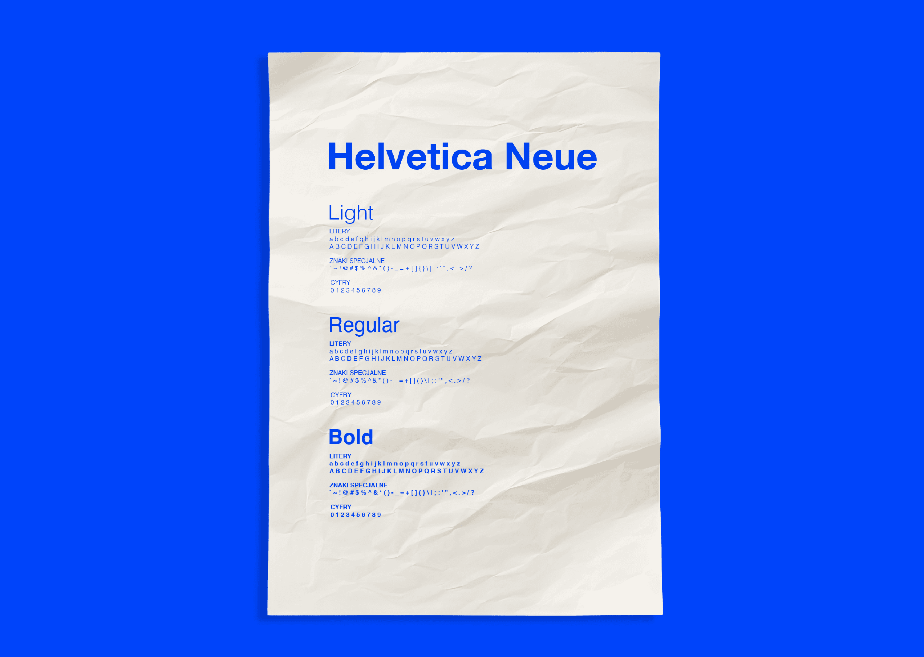
The Type: Clean, timeless, and rock-solid Helvetica Neue. This provides the professional, serious foundation.
The Color: A single, electric, unmissable blue. This ensures the brand is instantly recognizable, from a tiny guitar pick to a massive wall mural.

An Identity That Lives Everywhere.
The system was designed to be flexible, working across every touchpoint: from spinning vinyl labels and guitar picks to street-style merch, business cards, and large-scale signage. It's a complete, coherent world.


